
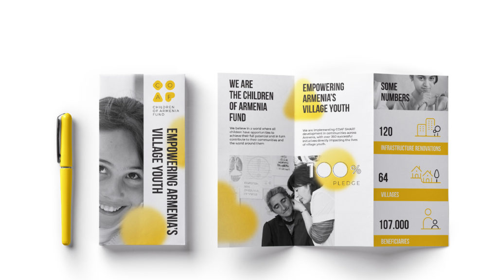
People often ask us what exactly we do in rural Armenia. The range of our projects is quite broad. Hence, it usually takes a little longer than a few sentences to explain the diversity of COAF programs. Well, the good news is, our refreshed brand look is there to help!
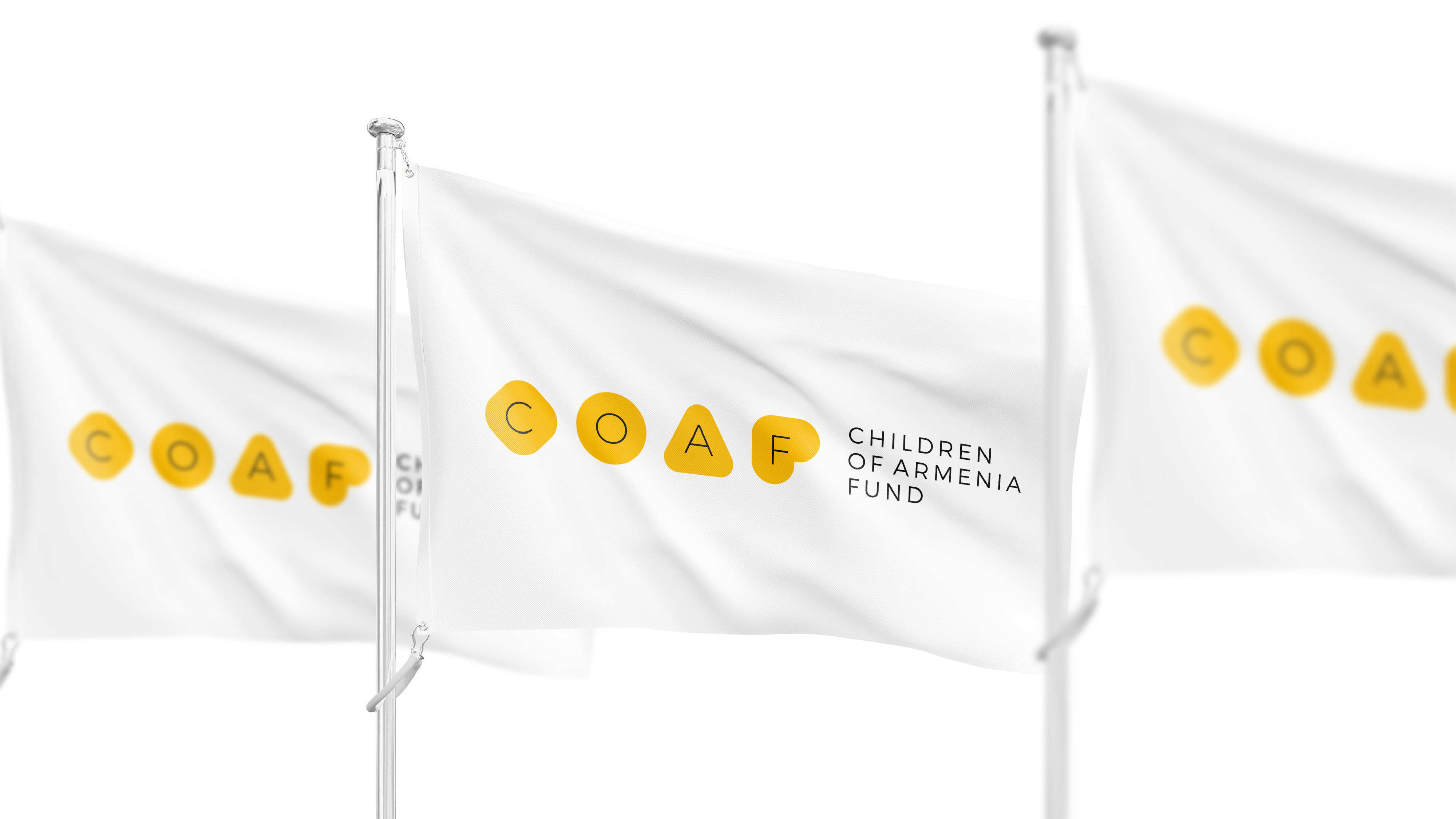
Our 2020 has been full of novelties: new team members, e-learning in a new format, and programs, some of which are still on their way. However, there was something that happened for the first time in COAF’s history! Introducing the fresh look of our visual identity!
Our new color is yellow
Yellow stands for freshness, happiness, joy, and optimism – all of which are strongly tied to our mission. Our programs bring a positive impact to the lives of village youth across Armenia, add a new color and meaning to our villagers’ lives, and provide resources conducive to better living standards.
Now, let’s get into the details.
The four components of our new logo reflect the four pillars of COAF:
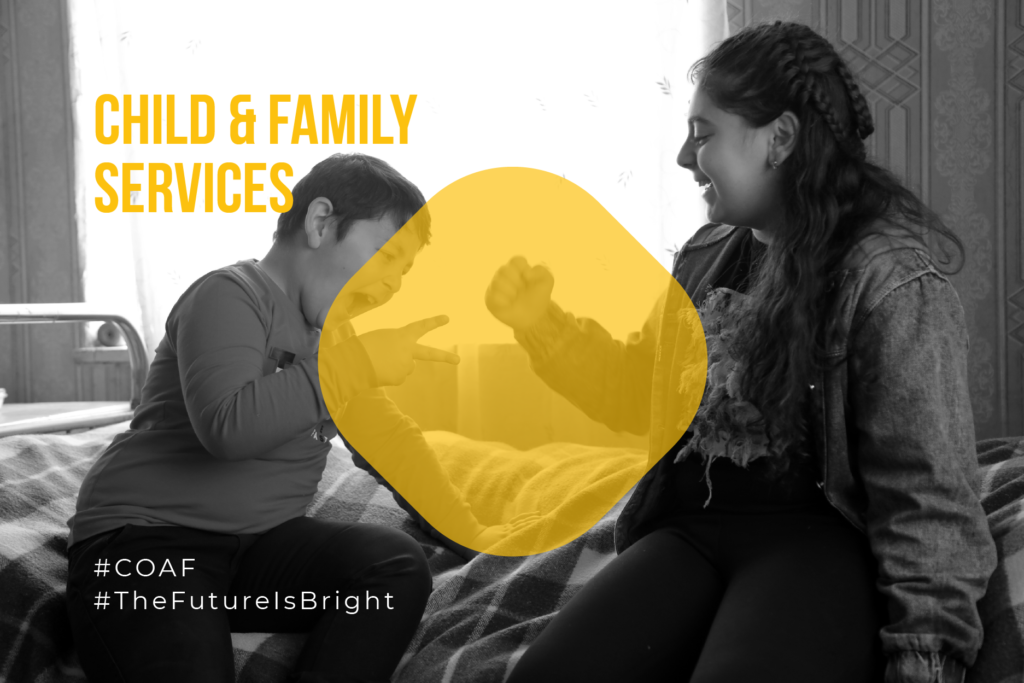
- Child & Family Services
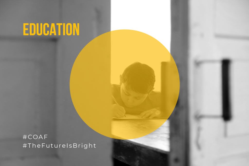
- Education
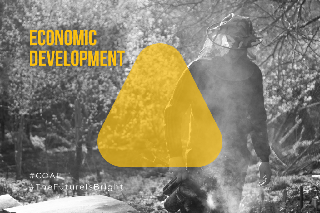
- Economic Development
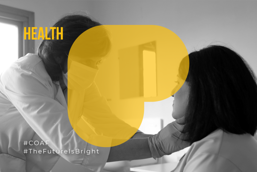
- Health
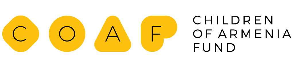
Each pillar has a story-telling characteristic shape that is a COAF letter at the same time. Starting from “C”, the rhombus with rounded corners reflects the environment, conditions, and atmosphere in which the child is raised. It stands for Child and Family Services that envision a happy childhood for every kid.
Education has its significant role and power of shaping the personality, empowering people to achieve their own unique greatness, and making one complete as an individual and professional.
Our Economic Development perspective is multi-angle and systematic. Through a family-centered approach, we promote economic self-sufficiency so that our villagers can stay in their community, use, and create economic opportunities across the country. The triangle shape depicts the ecosystem with its different components.
And, of course, the heart shape of the letter “F” stands for Health, reflecting our love and care for rural Armenians. Our health care programs seek to promote the well-being of the entire community.
The shapes can also form characters of a girl (shapes C & A) and a boy (shapes of O & F).
“After 16 years of on-the-ground experience, we keep expanding both the geography and the scale of our programs. Still, we are never tired or bored with the work, which is often massive. We wanted to convey freshness to our brand identity as we are energized and refreshed with each new program, every individual whose life changes for the better due to COAF’s initiatives. Time changes so fast, and to keep up with the trends, this way, we will look more modern and will represent our organization to our beneficiaries, benefactors, partners, and friends in a new way,” explains David Manoukian, the Communications Manager at COAF.
We are so full of new energy in bringing our mission to life. Solar energy is renewable. Similarly, our energy is refilled with each new story of impact and advancement.
Our old logo will always have a special place in COAF’s history. It’s the look many recognize us by, the symbol behind 16 years of hard work, togetherness, and impact. While we continue to work with the same diligence and commitment, we want to expand our community of supporters, reach more people who are far-sighted, caring, and give importance to giving back. We hope that our new brand identity will be a feast for your eyes and will reflect the warmth and care we have for our community.
With the winds of positive change, let’s fly to new, brighter heights together.


